Case study

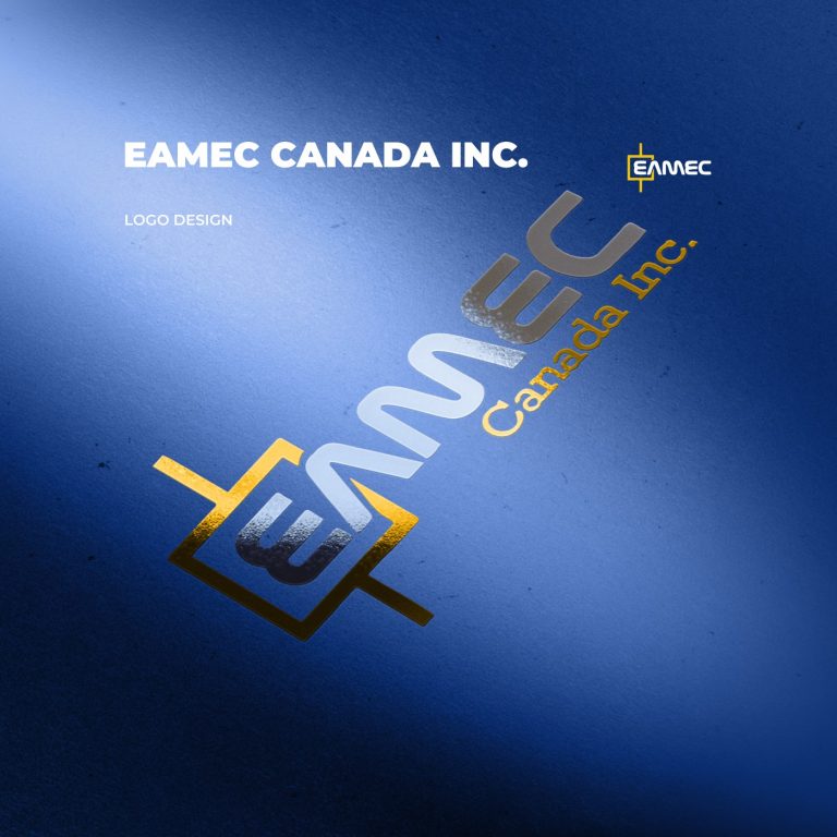
Eamec Canada Inc. Branding – Logo Design & Brand Identity

Eamec Canada Inc.
3 Days
Date
April 2014
Duration
3 Days
Brand colors
#efc111
#2b58ab
01 · Scope
What we covered
  • Logo design services for a Canadian engineering consultancy
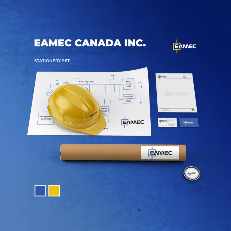
  • Complete brand identity system (logo, business cards, letterheads)
  • Corporate stationery design (official templates)
02 · Goals
What it had to achieve
  • Build a strong brand identity that reflects Eamec’s expertise in power systems engineering
  • Deliver a professional and consistent visual identity package for both print and digital use
  • Support the company’s marketing and corporate communication with modern, clear design
03 · Approach
How I solved it
  • Analyzed Eamec’s industry positioning and created a clean geometric logotype design to symbolize stability, power, and innovation
  • Designed corporate stationery (business card, letterhead) aligned with the logo and brand colors
  • Ensured all assets were optimized for digital marketing campaigns, presentations, and engineering documents
  • Delivered multiple logo variations for flexibility in website design, profiles, and print
04 · Delivery
What the client got
  • Final logo package (PDF, CDR, PNG, JPG)
  • Brand guideline and visual identity system
  • Business card and letterhead designs (print-ready)
  • Digital assets for web and social use
Tools used
Pen, Ink & Sketchbook, Corel Draw
Want something like this?
Gallery

Selected visuals

“

“The full visual identity package gave us a cohesive and professional image that immediately improved our brand perception with clients.”
~ R.Golmohamadi, Senior Electronical Engineer

~ Eamec Canada Inc.
Keep exploring

More projects

TigerHX (Hendrix Bowling)

TigerHX Bowling System – AAA Bowling Animation Production

View project ↗
Bloor Benoosh Iranian

Bloor – Bottled Water Branding, Packaging & Launch Assets

View project ↗
Milever Banner
Milever Iran

Milever Iran – Brand Identity, Website, Social Media, Promotional & Display Design

View project ↗