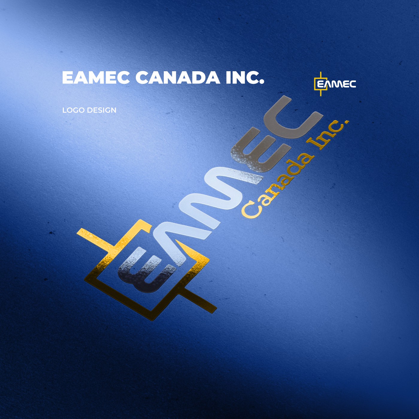
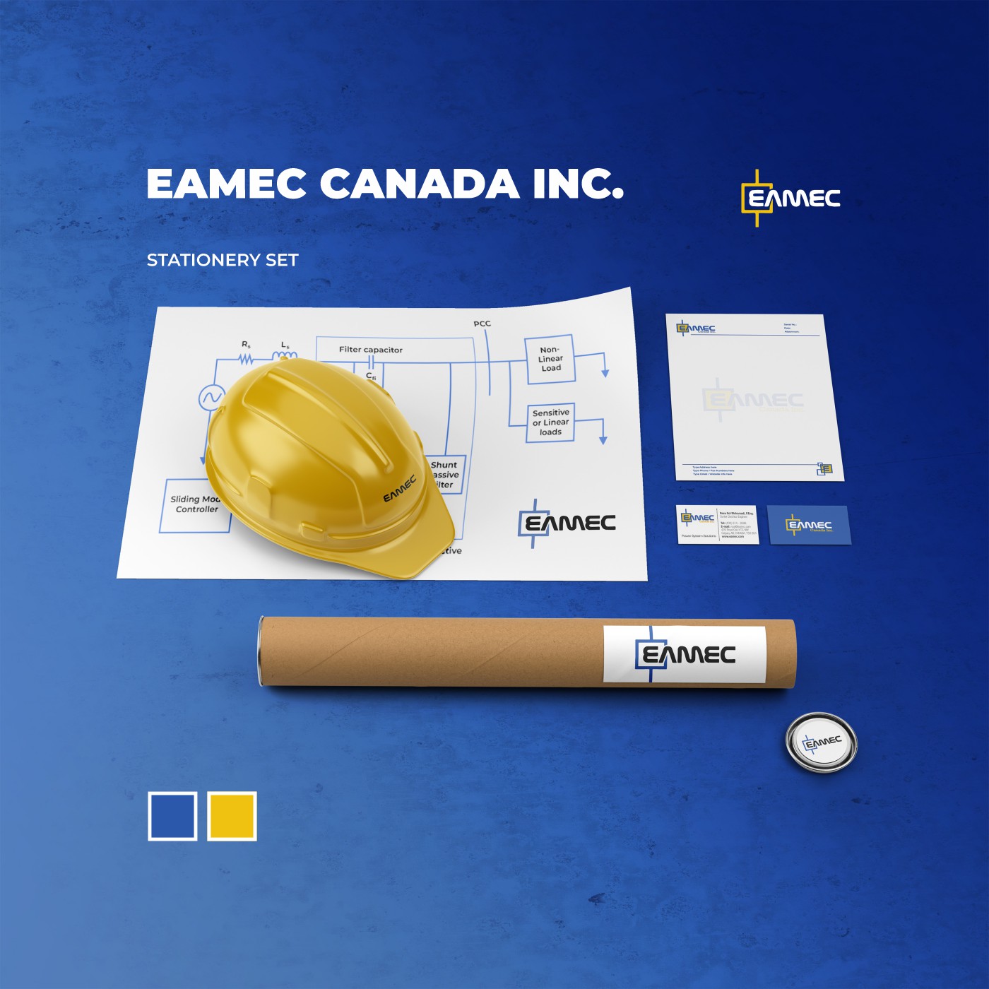
A professional branding and visual identity project for EAMEC Canada Inc., a specialized engineering firm based in Calgary, Alberta. The project focused on establishing a powerful corporate identity that reflects the company’s high-level expertise in reliability and power systems engineering. By combining technical symbolism with a sophisticated Canadian-corporate aesthetic, the new identity positions EAMEC as a leading authority in the energy, utility, and heavy industrial sectors.


The engineering field—specifically in power systems and reliability—is highly technical and often dry. The challenge was to create a brand that felt intellectually rigorous and stable (for risk-averse industrial clients) while appearing forward-thinking and innovative (for the renewable and data center markets).
Positioned as a Strategic Engineering Partner rather than just a contractor. EAMEC is the “Owner’s Engineer,” providing the oversight, technical depth, and reliability management necessary for large-scale, critical asset operations.
The visual system utilizes a palette of Structural Blue and Precision Steel, reflecting the industrial nature of transmission, oil, and gas.
The logo is designed to evoke concepts of connectivity, flow, and system integrity, ensuring it remains highly legible on both technical reports and heavy-duty on-site safety equipment.
#efc111
, #2b58ab
Pen, Ink & Sketchbook, Corel Draw
The new brand identity provided EAMEC with a unified voice to manage diverse multidisciplinary projects—ranging from SAGD mining in Alberta to compressor station harmonics in Quebec. This visual consistency has strengthened their reputation as a “Full Service” firm, facilitating easier entry into new sectors like Modular Data Centres (MDC) and renewables.